What visual changes does grid-awareness trigger on this site?
Published:
Table of Contents
A few people did actually read the "Making this website response to your local energy grid" post I wrote earlier this month. A few of those few people got in touch and asked me to share visual examples of what changes on this website when a person visits from a location where the electricity grid that's powered by mostly fossil fuel energy. I hope to capture those changes in this post.
That post linked above provides a lot of context for this post, so if you're not familiar with what's mean by a grid-aware website, or grid-aware changes, then I recommend reading it first.
In the post below, I'll be compare the "regular site" (the site that is presented to a visitor by default) to the "grid-aware site" (the version of this site that is presented to people visiting from areas powered by mostly fossil fuel energy).
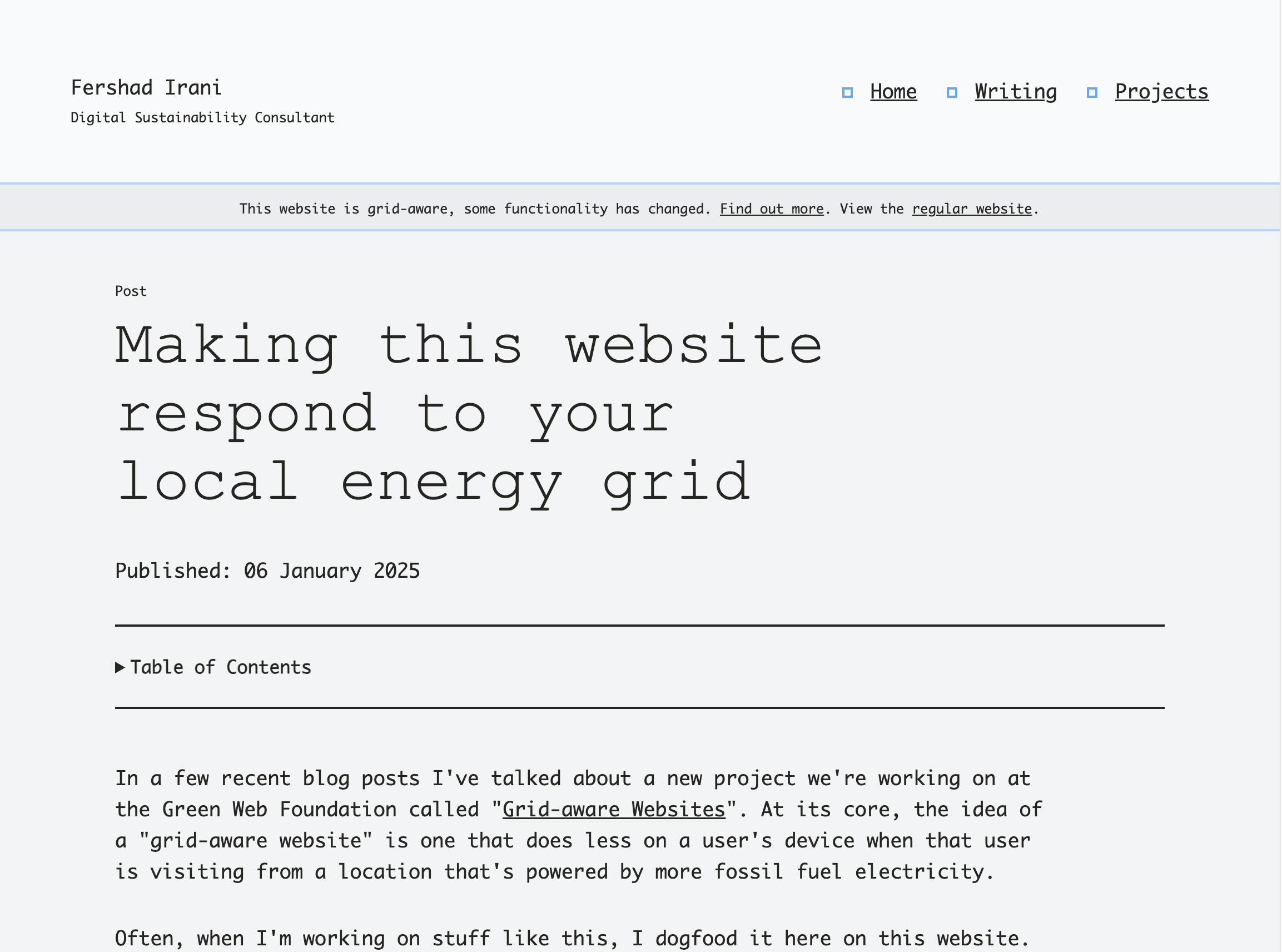
Exhibit 1 - Fonts and controls
Section titled Exhibit 1 - Fonts and controls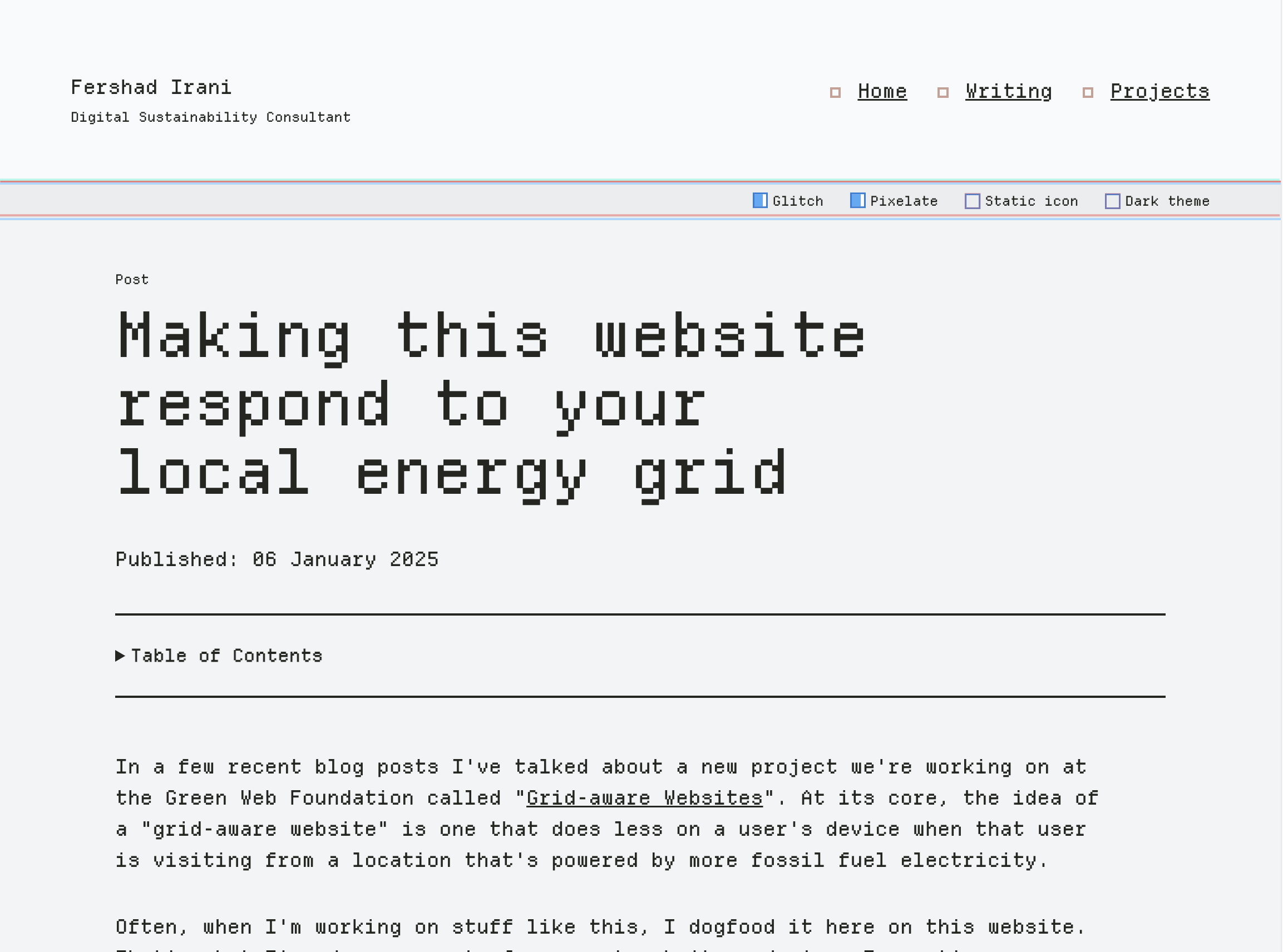
By default, users visiting this website have the choice "depixelate" the site - that is to remove the pixelated Depature Mono webfont. They are also presented with the option to "deglitch" (more on that later) the site, and set a "static favicon" (more on that later too).
On the grid-aware site, the Depature Mono font is already removed, the glitch effects are not applied, and the favicon doesn't change. Therefore, there's no need to include those "feature" switches on the website. Visually, the switches are removed, and under the hood the associated JavaScript that controls them is also removed from the page's HTML In their place is a banner pointing the user to some more information about the grid-aware website they are seeing, and a link to view the regular website instead. Clicking this link sets a key in local storage that will present the regular site to that visitor for 24 hours.
Exhibit 2 - Favicon fun
Section titled Exhibit 2 - Favicon fun
For "fun" (don't judge), I added some code on this site that shows a random favicon (taken from an array of emojis) on each page navigation or reload. Visitors to the regular site get this experience, and have the option to deactivate it using the switches mentioned above. If you're seeing the regular site, reload the page and you should see the favicon change. Fun stuff.
That code is a frivolous bit of JavaScript that gets removed on the grid-aware version of the site. Visitors who get that experience will see the same favicon on each page navigation or reload.
Exhibit 3 - Glitchy glitch
Section titled Exhibit 3 - Glitchy glitchAs explained in New year, new look, I've applied a glitchy effect to many of the components on this website.
When I started out, I was going to make something with boxes and CSS Grid. Half-way through I scrapped all that and changed to a glitchy, pixelated design style.
The glitch effects are entirely driven by CSS, but they result in a lot of animation and paint activity taking place in the browser. Users who get shown the grid-aware site are presented with a more austere design, without glitches and only a few animations (normally triggered by user action - e.g. hovering a link).
Exhibit 4 - Functional filters
Section titled Exhibit 4 - Functional filters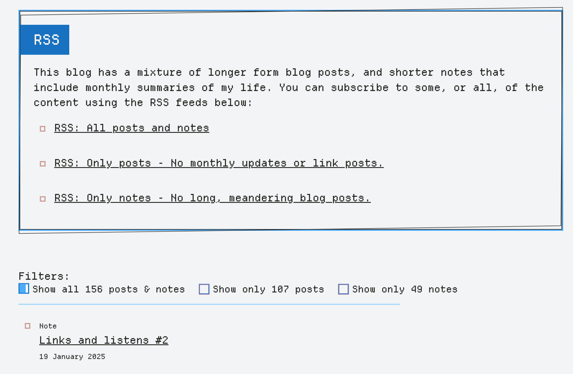
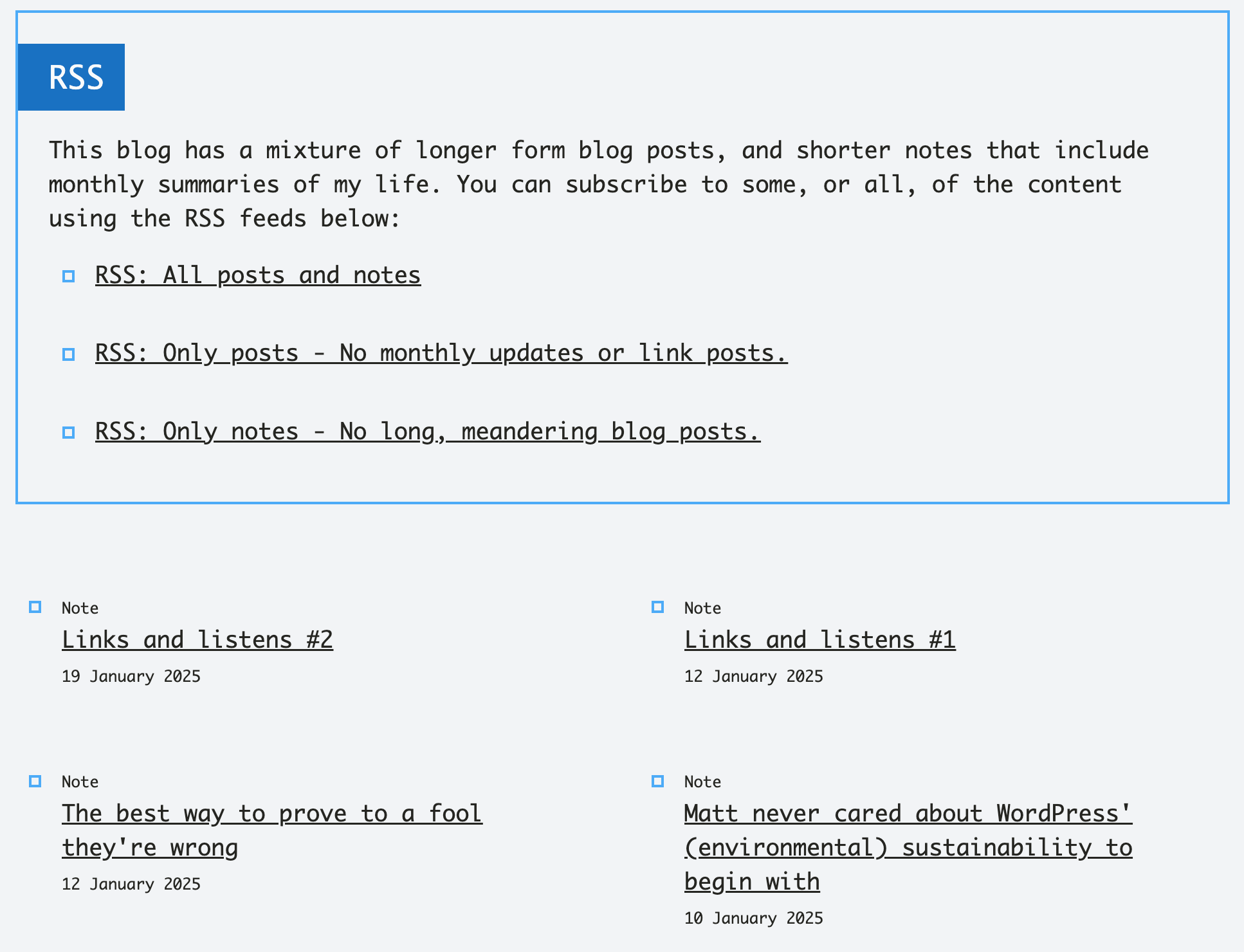
The /writing and /reading pages of this site have more content than other pages, and its all displayed in list format. On the /writing page (image above), there's a mix of document types - notes and posts. Filters on that page allows a user to only show one type of document if they want. This is driven by JavaScript, and the DOM on that page is pretty heavy, so there's a fair few nodes that get touched each time a filter is applied/removed. For that reason, those filters are removed on the grid-aware site.
On the /reading page, the list of content is shorter. But when I fetch the articles from the Readwise API, I also get chunks of summary text for each article listed. Adding this by default makes the page too long for my liking, so I've hidden it behind a filter. Users on the regular site can toggle "show summary" on and off if they wish. That said, the summary content is not critical, and so for the grid-aware site I remove that bit of JavaScript driven functionality too.
Exhibit 5 - Reading list refresh
Section titled Exhibit 5 - Reading list refresh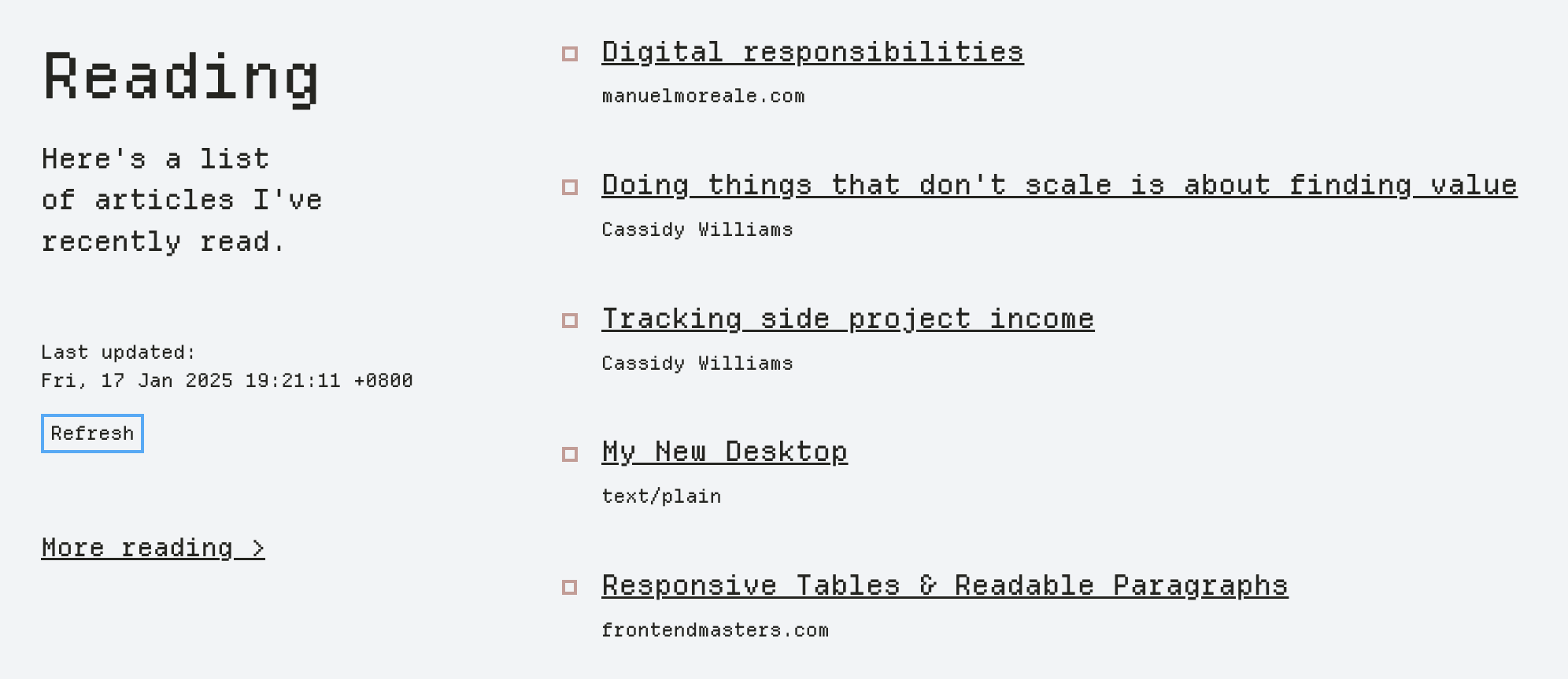
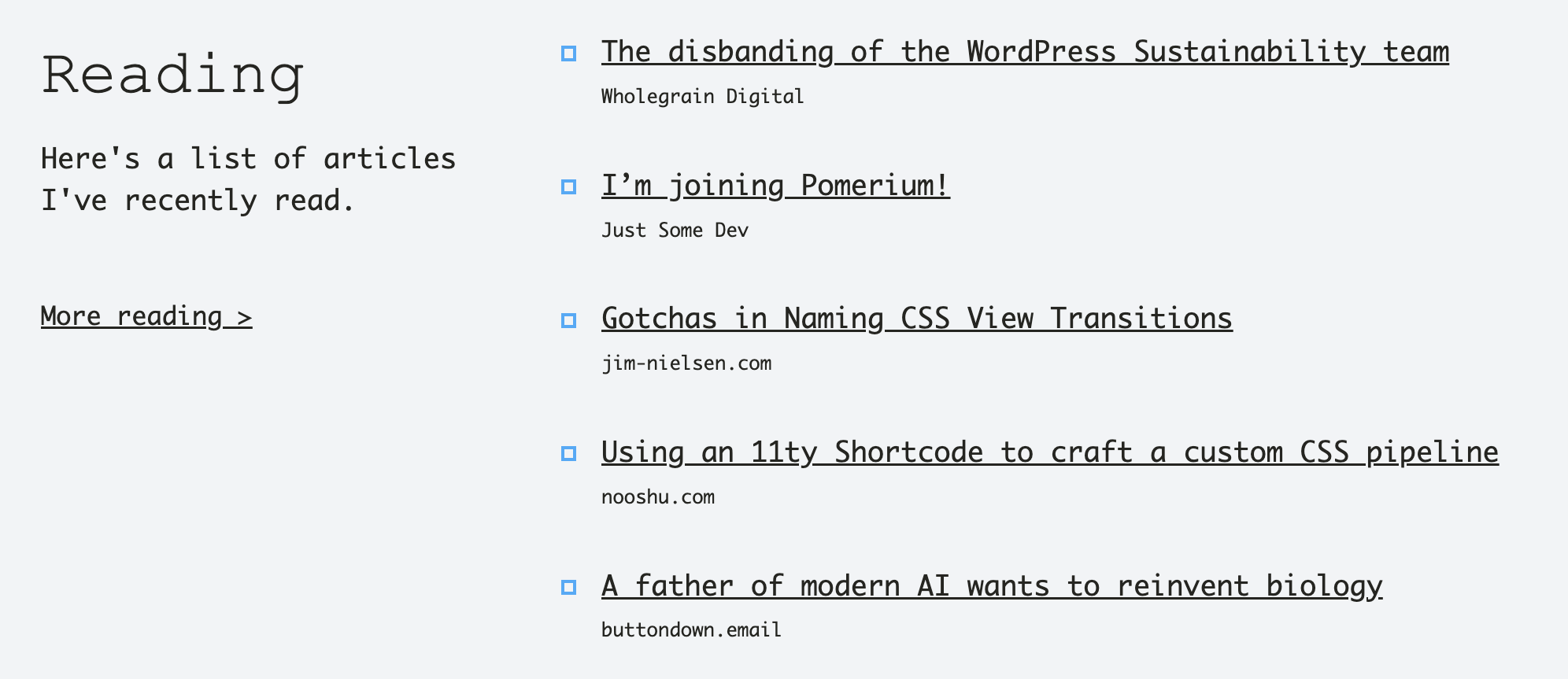
My reading list of recent articles (shown on the homepage and the /reading page) is generated whenever a new build of the website is triggered. That might not happen for days/weeks, and so content can get out of date quickly. To give visitors a chance to view an updated list of articles, there is a Refresh button on both pages. Pressing this button makes a request to an API endpoint that returns the latest articles I've read in Readwise. This functionality is, again, useful but not critical. To save a bit of energy that's used making the API request & DOM updates, I hide that button to users who are presented the grid-aware site.
Exhibit 6 - Rando film image
Section titled Exhibit 6 - Rando film imageAt the bottom of my homepage, I share some information about a film photography blog that I also maintain. You can check it out at film.fershad.com. In that section of the homepage, I've also got a link that reads "Get random image". When clicked, makes a request to an API endpoint that returns a random image, title and description. The new image replaces the previous one, and the text updates as well. For visitors who see the grid-aware site, the link instead takes them to film.fershad.com/random, a route I've setup on the film blog that redirects to a random image page instead.
Exhibit 7 - This very page
Section titled Exhibit 7 - This very pageOn this page, I've had to present several comparison images. To do that, I using the Image Compare web component by Cloudfour. I used it because it makes the presentation of this kind of content a bit more streamlined compared to showing multiple images. The web component is progressively enhanced, meaning that if the JavaScript for it doesn't load the images will still be shown but just stacked on top of each other.
So on the regular site, visitors can use the web component to view comparison images. Pssst - The image below is a static image for illustration purposes - don't try to move the handle in the middle 😅.

While visitors who use the grid-aware site will see the same images, but stacked on top of each other. The figure caption content is also slightly adjusted to accommodate the two layouts.

There's also video content on this page, which I've used because it was the easiest way to show the respective bits of content. For now, the video is the same for all visitors.
Conclusion
Section titled ConclusionI hope that this post presents a slightly better explanation of the changes that occur on this site as part of my experimentation with building a grid-aware website. If you've got feedback or ideas, I'd love to hear them.
One change that's on my mind to change to a more "progressive enhancement" approach to this. That's one where the grid-aware site would be the default, and then visitors who are in locations where the energy grid is powered by more low carbon sources get a "jazzed up" version of the site. Naming things is hard.